Basic Plotting with Matplotlib
Contents
12. Basic Plotting with Matplotlib#
12.1. Lesson overview#
The ability to visualize data graphically is an important skill for an engineer. These graphical representations are often referred to as “figures” or “plots”, and they are vital when analyzing data or communicating information to an audience. Even though the Python terminal is a text-based interface, there are numerous graphing libraries available. One of the most popular graphing libraries is Matplotlib. In this lesson, we will cover the basics of plotting using Matplotlib by showing how to plot a single dataset, creating a plot with multiple datasets, creating a multiple panel plot, and finally creating a plot that has error bars. We will then conclude the lesson by showing how to export created figures for further use.
12.2. Importing the Matplotlib library#
The Matplotlib library is not part of the standard Python library. However, most scientific Python package distributions (like Anaconda) come with Matplotlib already installed. Therefore, if you are using Anaconda to manage your Python environment, you do not need to manually install Matplotlib. If you are not running Anaconda and need to install Matplotlib, you can find installation instructions here.
The Matplotlib library is large and can feel overwhelming at first. Fortunately, most basic plotting functionality can
be found in the matplotlib.pyplot module. A common route to
import Matplotlib into Python is shown below:
import numpy as np
from matplotlib import pyplot as plt
%matplotlib inline
As seen above, three commands are needed. The first command is to import NumPy. As discussed
in a previous lesson, NumPy is a powerful scientific computing library for Python. In addition to providing additional
features such as mathematical operations and array structures, Matplotlib natively reads NumPy datasets. While
technically not needed for plotting purposes, using NumPy library is highly encouraged when plotting with Matplotlib.
Next, the second command is the actual code that imports the module
pyplot from Matplotlib. An alias name plt is used for ease
of typing. Finally, the last command tells JupyterLab to display plots in the IPtyhon notebook using an “inline” format.
This last command is only needed if you plan on using JupyterLab for your coding environment.
12.3. Plotting a single dataset#
Creating a simple plot that visualizes one dataset is easy using the
pyplot module. Matplotlib provides two routes to call
pyplot-based functions. The first route, which is often referred to as the “implicit route”, follows a code
structure similar to how MathWorks’s MATLAB programming platform creates figures. The second route is often called the
“explicit route”, and offers more flexibility when customizing figures, but does require basic knowledge in
object-oriented programming (specifically calling attributes and methods of objects). Since an earlier lesson in
this toolkit goes over this basic knowledge, this lesson will focus on using the explicit route when
calling pyplot.
Hey! Listen!
The Matplotlib library is extensive with numerous submodules, functions, attributes, and methods. This lesson will
provide only a cursory overview of a fraction of these features. When looking for a certain aspect or feature, it is
highly recommended to search the Matplotlib reference guide, run the
help() function on a particular feature, and perform internet searches. This lesson will also provide links to every
function and method used for further exploration.
Matplotlib handles most simple plotting through the use of two built-in data classes:
Figure and
Axes. The Figure class can be thought of as
the entire figure itself. This acts as the “canvas” for all the features that will be shown in
the figure (e.g., axis, borders, data points, labels, etc.). The Axes class represents the content of a figure panel.
While this may seem confusing at first in the context of a single panel figure, the use of Axes objects becomes very
powerful when creating multiple panel figures (i.e., multiple subpanel figures on a canvas). Therefore, one can have
multiple Axes objects to a single Figure object.
Let us create a simple figure that has one panel:
fig1 = plt.figure()                               # Creates Figure object
ax = fig1.add_subplot(1, 1, 1)                    # Creates Axes object

plt.show()                                        # Shows plot
There are three commands issued in the above code block. The first command uses the function
pyplot.figure() (Note: the command uses the
plt alias that we previously defined) to create a Figure object called fig1. No arguments are passed into the
function so default values are used, which are good for this example. However, there are many optional arguments that
can be passed, so if you are interested you should either run the help() function on pyplot.figure() or visit
Matplotlib’s documentation on
pyplot.figure(). This command creates the
white background “canvas” that you see in the displayed figure.
The second command calls the Figure method
add_subplot() to create an
Axes object named ax. It is this command that creates the actual figure content (here just the x and y axes).
Three input arguments are passed into add_subplot(). The first two arguments represent the number of rows and columns
of subpanel figures to be organized in fig1 (arguments called nrows and ncols, respectively). The third argument
is the positioning index number (called index) that ax will represent in the figure. For our current needs, we just
need oneAxes object (i.e., one panel), so the (1, 1, 1) input argument suffices. Finally, the last command is
the function pyplot.show(), which is used to
display the figure. This command is placed after all other figure-based commands are typed out.
A blank figure is not that interesting. Let us now create some data to plot. For this example, we will plot the function,
First, let us create both the \(x_1\) and \(y_1\) datasets using NumPy:
x1 = np.arange(1, 11, 0.1)
y1 = 10 * np.cos(2*x1)
The updated code block below now includes the necessary command to plot \(x_1\) and \(y_1\):
fig1 = plt.figure()                               # Creates Figure object
ax = fig1.add_subplot(1, 1, 1)                    # Creates Axes object

ax.plot(x1, y1)                                   # Plots data to Axes

plt.show()                                        # Shows plot
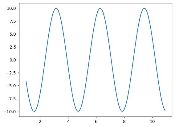
Note the new command ax.plot(x1, y1) in the code block, which calls the ax method
.plot()
(recall that ax is part of the Axes class). In this example, .plot() only requires two input arguments, x1 and
y1, in order to create a plot. Therefore, Matplotlib only requires four commands to produce a simple figure!
12.4. Prettying things up#
While the figure above is serviceable, it is lacking many important aspects like axes labels, well formatted tick marks,
and a title (since we do not have a figure caption). As mentioned earlier, the Axes object of the figure
represents the content of the figure. So we can modify various aspects of the figure by calling the appropriate method.
For example, let us update our current code block to set figure and axes titles using the following methods:
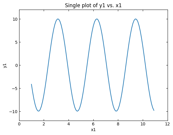
fig1 = plt.figure()                               # Creates Figure object
ax = fig1.add_subplot(1, 1, 1)                    # Creates Axes object

ax.plot(x1, y1)                                   # Plots data to Axes
ax.set_title("Single plot of y1 vs. x1")          # Sets Axes title
ax.set_xlabel("x1")                               # Sets x-axis label
ax.set_ylabel("y1")                               # Sets y-axis label

plt.show()                                        # Shows plot
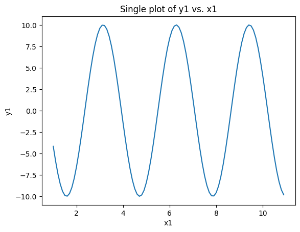
Here we provide a figure title using the method
.set_title() and create
x-axis and y-axis labels with the methods
.set_xlabel() and
.set_ylabel(), respectively.
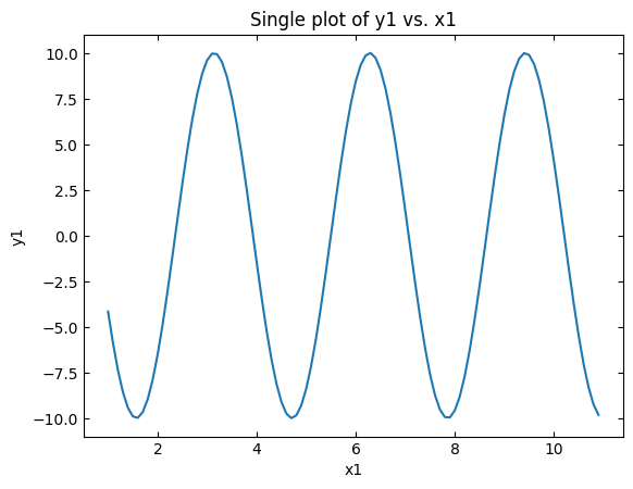
We can modify an axis’s tick marks using the method
.tick_params(). The modified
code below sets the tick marks to point inside on all four sides of the figure (also known as “spines”):
fig1 = plt.figure()                               # Creates Figure object
ax = fig1.add_subplot(1, 1, 1)                    # Creates Axes object

ax.plot(x1, y1)                                   # Plots data to Axes
ax.set_title("Single plot of y1 vs. x1")          # Sets Axes title
ax.set_xlabel("x1")                               # Sets x-axis label
ax.set_ylabel("y1")                               # Sets y-axis label
ax.tick_params(
               axis="both",                     # Both x- & y-axis ticks to be adjusted
               direction="in",                  # Tick mark direction set to inside
               top="on",                        # Display tick marks for top axis / spine
               right="on"                       # Display tick marks for right axis / spine
              )

plt.show()                                        # Shows plot
Finally, we can adjust the display range for both the x and y axes by using the methods
.set_xlim() and
.set_ylim(), respectively. The
updated code block below sets the x axis range from 0 \(\rightarrow\) 12 and the y axis range from
-12 \(\rightarrow\) 12:
fig1 = plt.figure()                               # Creates Figure object
ax = fig1.add_subplot(1, 1, 1)                    # Creates Axes object

ax.plot(x1, y1)                                   # Plots data to Axes
ax.set_title("Single plot of y1 vs. x1")          # Sets Axes title
ax.set_xlabel("x1")                               # Sets x-axis label
ax.set_ylabel("y1")                               # Sets y-axis label
ax.tick_params(
               axis="both",                     # Both x- & y-axis ticks to be adjusted
               direction="in",                  # Tick mark direction set to inside
               top="on",                        # Display tick marks for top axis / spine
               right="on"                       # Display tick marks for right axis / spine
              )
ax.set_xlim(left=0, right=12)                 # Sets x-axis range
ax.set_ylim(bottom=-12, top=12)               # Sets y-axis range

plt.show()                                        # Shows plot
As seen in the above example, it is relatively straightforward to produce aesthetically pleasing plots. The hardest part sometimes is actually searching the Matplotlib documentation to find the exact feature needed. The following examples will further expand our plotting options to include plotting multiple data sets, adding point markers, changing line styles, including color, and adding error bars.
12.4.1. Example: Pretty little transmission spectrum#
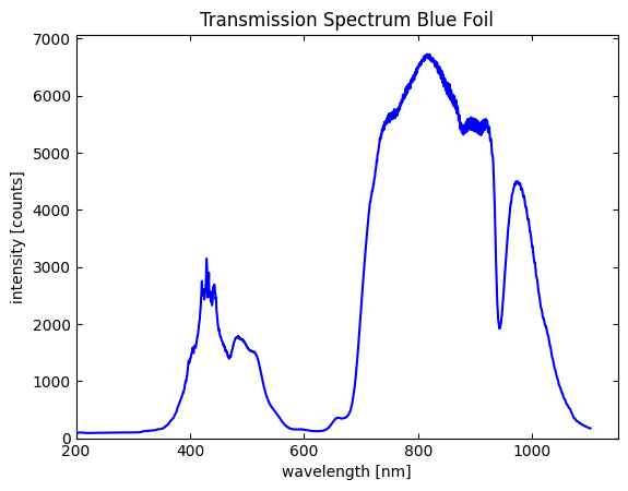
Plot the following data file using Matplotlib. This
file contains optical transmission data from a blue foil. The first column in the data file is the wavelength of light
measured and the second column is the detected light intensity. Make a line plot of intensity vs. wavelength (i.e.,
y vs. x!). Additional plotting tips / requirements are below:
Use the
numpy.loadtxt()function to load the data into the Python environment. We introduced this useful function in an earlier lesson. The first row of the file contains header data, so you should use theskiprowargument to ignore the first row when importing. Also, the data rows are “tab-delimited”, so you should set thedelimiterargument to"\t"(i.e., the tab escape character) so Python can properly read the file.Create a title to the figure called “Transmission Spectrum Blue Foil”.
Properly label both x and y axes with labels and units.
Plot the data as a blue colored solid line.
Have the wavelength axis display from 200 to 1150 nm.
Have the intensity axis display up from 0 counts.
Solution:
The hardest part in this exercise is actually loading the data file into Python! Loading external files into Python
is a common task, so it is good to get some practice. Entering the correct path name is usually where most people get
errors, so be mindful on where you are saving the downloaded data file. Also, the arguments delimiter="\t" and
skiprows=1 are needed in order to read the file.
From there we adapt the code introduced in the lesson above to our needs. The overall code block is below:
import numpy as np
from matplotlib import pyplot as plt
%matplotlib inline

# Load data
spectrum_data = np.loadtxt("./example_data/blue_foil_transmission_spectrum.txt",
                           delimiter="\t",
                           skiprows=1)

wavelength = spectrum_data[:, 0]
intensity = spectrum_data[:, 1]

# Plot data
figA = plt.figure()                               # Creates Figure object
ax = figA.add_subplot(1, 1, 1)                    # Creates Axes object

ax.plot(wavelength, intensity,                    # Plots data to Axes
        linestyle="solid",
        color="blue")
ax.set_title("Transmission Spectrum Blue Foil")   # Sets Axes title
ax.set_xlabel("wavelength [nm]")                  # Sets x-axis label
ax.set_ylabel("intensity [counts]")               # Sets y-axis label
ax.tick_params(
               axis="both",                       # Both x- & y-axis ticks to be adjusted
               direction="in",                    # Tick mark direction set to inside
               top="on",                          # Display tick marks for top axis / spine
               right="on"                         # Display tick marks for right axis / spine
              )
ax.set_xlim(left=200, right=1150)                 # Sets x-axis range
ax.set_ylim(bottom=0, top=7000)                  # Sets y-axis range

plt.show()                                        # Shows plot
12.5. Plotting multiple datasets to a single figure#
Matplotlib allows for plotting multiple datasets to a single figure panel. To demonstrate this, let us plot the following equations to a single panel figure,
Our first step is to create the various data points using commands from the NumPy library:
x = np.arange(1, 11, 0.2)

y1 = 10 * np.cos(2*x)
y2 = 0.001 *np.exp(x) - 2.1
y3 = 2 * np.power(x,2) - (10 * x) - 3
Next, we follow our previous example by creating a Figure object that represents the overall figure (let us call it
fig2) and an Axes object that represents the actual content of the figure (let us call it ax). After that, we then
implement .plot() three times in order to plot each data set. The code block below demonstrates how to implement this and also shows how
to customize each dataset:
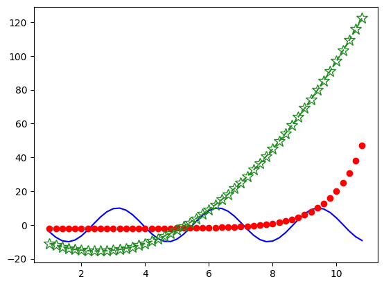
fig2 = plt.figure()
ax2 = fig2.add_subplot(1, 1, 1)

ax2.plot(x, y1, label="cosine", linestyle="solid", color="blue")
ax2.plot(
        x, y2,
        label="exponent",             # Dataset label
        marker="o",                   # Data point marker format
        linestyle="none",             # Type of connecting line
        color="red"                   # Overall color of dataset
       )
ax2.plot(
        x, y3,
        label="polynomial",
        marker="*",
        fillstyle="none",
        markersize=12,                # Marker size
        linestyle="dashed",
        color="forestgreen"
       )

plt.show()
While there are a few new arguments in each call of .plot(), the overall setup is similar to before. In each call of
.plot() the first two arguments are the x value and the y value of the dataset followed by additional arguments.
Comments have been placed in the code block to help you understand the new arguments, and a quick rundown of each new
argument is listed below:
label- Label to be displayed in a figure legend. Entered value is astr.marker- Type of marker to be used (e.g., circle, square, triangle) when displaying a data point. Matplotlib’s Marker reference page has a list of commonly used markers. Entered value is astrthat represents a marker type (e.g.,orepresents a filled circle). Default value isNone, meaning no data point will be shown.fillstyle- Sets how the marker’s interior will be filled with color. Entered value is astr. Matplotlib’s Marker reference page has a list of fill styles.set_markersize- Sets the size of the marker in points. Entered value is afloat.linestyle- Style of the connecting line between data points. Entered value is astr, and the default value is a solid line (code:solid). Matplotlib’s Linestyles page is a good source for different linestyles.color- sets the color state for both the marker and connecting line. There are few different ways of designating a color (e.g., RGB value, shorthand single character notation, color name), and all values are entered as astr. Matplotlib’s Specifying Colors page is a good guide to the various ways that color can be declared. Furthermore, Matplotlib’s List of named colors page is a good reference for commonly used color names.
Note
Notice that .plot() for y1 is written out differently from y2 and y3. For y1 all the input arguments are
entered in a single line, while the other two variables have their input arguments entered on separate lines (except for
the x and y values). Both display routes are acceptable routes and simply chosen for readability. For short input
lists, writing everything in a single line is best, but if there are numerous arguments, it is better to enter
everything on a separate line (with the proper indentation of course!).
Using this information, we can see that the dataset for y1 is a solid blue line, y2 has red filled markers with no
connecting line, and y3 has forest green star shaped markers (unfilled and enlarged to size 12) with a dashed
connecting line. While the resulting figure is serviceable, it lacks the usual flourishes to make a figure more
readable and impactful. The updated code block below uses the axes labels, tick marks, axes display limits, and title
methods from the last lesson, but also adds a legend without a border using the method
.legend():
fig2 = plt.figure()
ax2 = fig2.add_subplot(1, 1, 1)

ax2.plot(x, y1, label="cosine", linestyle="solid", color="blue")
ax2.plot(
        x, y2,
        label="exponent",                  # Dataset label
        marker="o",                        # Data point marker format
        linestyle="none",                  # Type of connecting line
        color="red"                        # Overall color of dataset
       )
ax2.plot(
        x, y3,
        label="polynomial",
        marker="*",
        fillstyle="none",
        markersize=12,                     # Marker size
        linestyle="dashed",
        color="forestgreen"
       )

ax2.set_title("Multiple dataset plot")     # Sets Axes title
ax2.set_xlabel("x")
ax2.set_ylabel("y")
ax2.tick_params(
               axis="both",
               direction="in",
               top="on",
               right="on"
              )
ax2.set_xlim(left=0, right=12)
ax2.set_ylim(bottom=-30, top=150)
ax2.legend(frameon=False)                   # Create legend w/o border

plt.show()
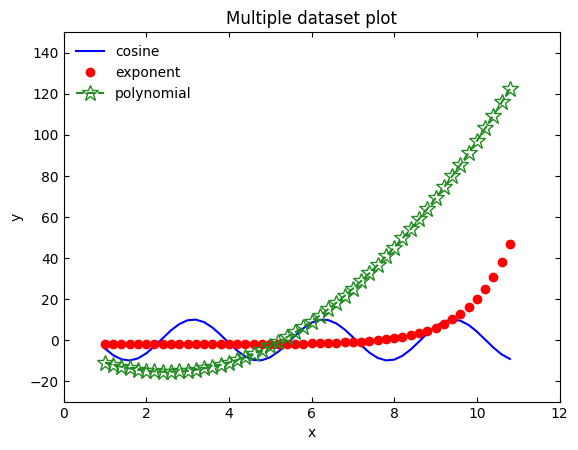
Now the figure is readable and impactful! As seen in this example, plotting multiple datasets to a single figure panel
in Matplotlib is straightforward as it only requires multiple callings of .plot().
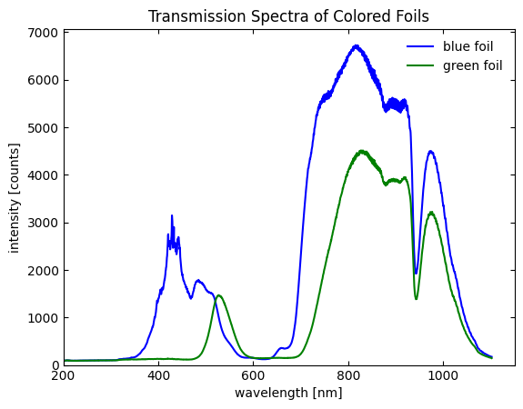
12.5.1. Example: Even more spectra#
Replot the blue foil optical transmission spectrum from the previous example but also
include the transmission spectrum for a green foil as well in the figure. The data file for this sample can be found
here. Rename the figure title to be “Transmission
Spectra of Colored Foils” and add a legend. Color code the data sets so that the blue foil data is blue and the
green foil data is green.
Solution:
As the lesson above discusses, plotting multiple data sets in a common figure is straightforward with Matplotlib. We
just need to ensure that all data sets are plotted to the same Axes object (this also implies a common Figure
object). From here, we issue separate .plot() calls for each data set and then a .legend() command to display the
legend. The code below demonstrates this:
import numpy as np
from matplotlib import pyplot as plt
%matplotlib inline

# Blue foil data load
blue_foil = np.loadtxt("./example_data/blue_foil_transmission_spectrum.txt",
                           delimiter="\t",
                           skiprows=1)

blue_wavelength = blue_foil[:, 0]
blue_intensity = blue_foil[:, 1]

# Green foil data load
green_foil = np.loadtxt("./example_data/green_foil_transmission_spectrum.txt",
                           delimiter="\t",
                           skiprows=1)

green_wavelength = green_foil[:, 0]
green_intensity = green_foil[:, 1]

# Plotting of data
figB = plt.figure()                                       # Creates Figure object
axB = figB.add_subplot(1, 1, 1)                           # Creates Axes object

axB.plot(blue_wavelength, blue_intensity,                 # Plots blue foil to Axes
        linestyle="solid",
        color="blue",
        label="blue foil")

axB.plot(green_wavelength, green_intensity,               # Plots blue foil to Axes
        linestyle="solid",
        color="green",
        label="green foil")

axB.set_title("Transmission Spectra of Colored Foils")   # Sets Axes title
axB.set_xlabel("wavelength [nm]")                        # Sets x-axis label
axB.set_ylabel("intensity [counts]")                     # Sets y-axis label
axB.tick_params(
               axis="both",                     # Both x- & y-axis ticks to be adjusted
               direction="in",                  # Tick mark direction set to inside
               top="on",                        # Display tick marks for top axis / spine
               right="on"                       # Display tick marks for right axis / spine
              )
axB.set_xlim(left=200, right=1150)              # Sets x-axis range
axB.set_ylim(bottom=0, top=7000)                # Sets y-axis range
axB.legend(frameon=False)                       # Create legend w/o border

plt.show()                                      # Shows plot
12.6. Multiple panel plotting#
In addition to single panel plotting, Matplotlib also allows for multiple panel plotting. This is relatively
straightforward if you understand how to do single panel plotting. All that one needs to do is create separate Axes
objects for each subpanel figure that will reside in a common Figure object.
To see this in action, let us revisit our previous scenario where we plotted three mathematical functions in one figure panel. Let us now plot all of these functions on separate subpanels. This is implemented with the following code:
fig3 = plt.figure()

axA = fig3.add_subplot(2, 2, 1)                                 # Creates axA in top left corner

axB = fig3.add_subplot(2, 2, 2)                                 # Creates axB in top right corner

axC = fig3.add_subplot(2, 2, 3)                                 # Creates axC in top right corner

plt.show()
Here you can see three separate Axes objects (axA, axB, and axC) are created and organized in 2 x 2 grid.
The new feature in this code block is within the .add_subplot() call as the first and second arguments (nrows
and ncols, respectively; discussed earlier) are 2, meaning a 2 x 2 grid of subpanel figures
will be created. The third argument value (known as the index value, again
see earlier discussion), tells the Python shell the location of each Axes object. Here, axA has
index = 1, meaning it is located the top left subpanel figure, ax2 has index = 2, placing it
in the top right corner, and ax3 has index = 3, placing it in the bottom left corner.
To plot the data into each subpanel, we again run the method .plot() but now calling it for each of the three
Axes object. The code block below puts y1 into the upper left corner, y2 in the upper right corner, and y3 in
the lower left corner:
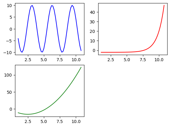
fig3 = plt.figure()

axA = fig3.add_subplot(2, 2, 1)                                 # Creates axA in top left corner
axA.plot(x, y1, label="cosine", color="blue")                   # Plot axA

axB = fig3.add_subplot(2, 2, 2)                                 # Creates axB in top right corner
axB.plot(x, y2, label="exponent", color="red")                  # Plot axB

axC = fig3.add_subplot(2, 2, 3)                                 # Creates axC in top right corner
axC.plot(x, y3, label="polynomial", color="forestgreen")        # Plot axis

plt.show()
Now we add our basic axes and title labeling commands for readability purposes. When creating axes and panel labels,
make sure to call the appropriate method using the correct Axes object in question. Furthermore, we can also add an
overall figure title by calling the Figure class method
.suptitle(). An example of how
these method calls can be implemented is shown in the code block below:
fig3 = plt.figure()
fig3.suptitle("Main figure title")                              # Title for overall figure


axA = fig3.add_subplot(2, 2, 1)                                 # Creates axA in top left corner
axA.plot(x, y1, label="cosine", color="blue")                   # Plots axA
axA.set_title("Cosine plot")
axA.set_xlabel("x")
axA.set_ylabel("y1")

axB = fig3.add_subplot(2, 2, 2)                                 # Creates axB in top right corner
axB.plot(x, y2, label="exponent", color="red")                  # Plots axB
axB.set_title("Exponential plot")
axB.set_xlabel("x")
axB.set_ylabel("y2")

axC = fig3.add_subplot(2, 2, 3)                                 # Creates axC in top right corner
axC.plot(x, y3, label="polynomial", color="forestgreen")        # Plots axis
axC.set_title("Polynomial plot")
axC.set_xlabel("x")
axC.set_ylabel("y3")

plt.show()
As seen above, the overall size of fig3 is causing overlap of the various subpanels. One way to fix this is to
increase the overall figure size. This is done by using the argument
figsize when initializing fig3. The default size for figsize
is set to (6.4, 4.8) which represents a 6.4 in wide by 4.8 in high figure. Try running the code block below changes
the figure size to 12 in wide by 10 in high:
fig3 = plt.figure(figsize=(12, 10))                             # Figure size is 12 in x 10 in
fig3.suptitle("Main figure title")                              # Title for overall figure


axA = fig3.add_subplot(2, 2, 1)                                 # Creates axA in top left corner
axA.plot(x, y1, label="cosine", color="blue")                   # Plot to axA
axA.set_title("Cosine plot")
axA.set_xlabel("x")
axA.set_ylabel("y1")

axB = fig3.add_subplot(2, 2, 2)                                 # Creates axB in top right corner
axB.plot(x, y2, label="exponent", color="red")                  # Plot to axB
axB.set_title("Exponential plot")
axB.set_xlabel("x")
axB.set_ylabel("y2")

axC = fig3.add_subplot(2, 2, 3)                                 # Creates axC in top right corner
axC.plot(x, y3, label="polynomial", color="forestgreen")        # Plot to axis
axC.set_title("Polynomial plot")
axC.set_xlabel("x")
axC.set_ylabel("y3")

plt.show()
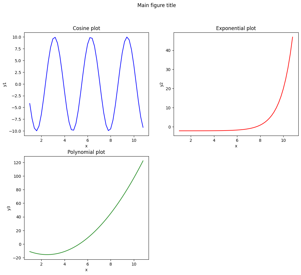
This change increases the overall figure size and aspect ratio to prevent the subpanel figures from overlapping. In
general, the figsize argument is useful when you need to modify either the overall size of a figure or change its
aspect ratio.
12.7. Plotting with error bars#
Making a plot with error bars on both the x and y values of a data point is straightforward with Matplotlib. To see how this works, we will create a single panel figure that plots the mathematical function,
In this example, we will assume that the size of the error bars on \(x_4\) is \(\pm |0.05x_4|\) and size of the error
bars on \(y_4\) is \(\pm |0.50y_4|\). To create this plot, we replace the method .plot() with
.errorbar().
This method is similar to .plot() in its implementation, but also includes additional input arguments to describe
the error bars. The code block below implements .errorbar() when plotting the above function:
x4 = np.arange(0.1, 20, 0.4)
x4_error = abs(0.05 * x4)
y4 = (10 * np.cos(2 * x4)) / (x4)
y4_error = abs(0.50 * y4)

fig4 = plt.figure()
ax4 = fig4.add_subplot(1, 1, 1)

ax4.errorbar(x4, y4,                 # Plot with error bars
             xerr=x4_error,          # x-axis error bars
             yerr=y4_error,          # y-axis error bars
             marker="p",
             markersize=8,
             linestyle="none",
             color="chocolate",
             capsize=5               # error bar cap size
            )

ax4.set_title("Plot with Error Bars")
ax4.set_xlabel("x4")
ax4.set_ylabel("y4")
ax4.tick_params(axis="both", direction="in")
ax4.tick_params(top="on")
ax4.tick_params(right="on")
ax4.set_xlim(left=0, right=20)
ax4.set_ylim(bottom=-12, top=12)

plt.show()
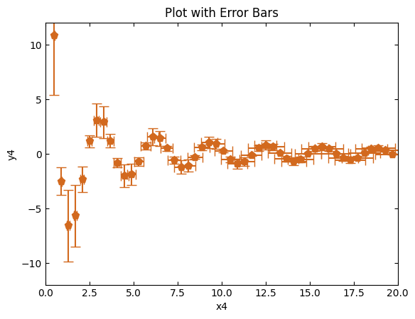
The overall code layout should look similar to the previous examples, and comments are used to highlight new commands. Overall, making effective plots with error bars is straightforward with Matplotlib.
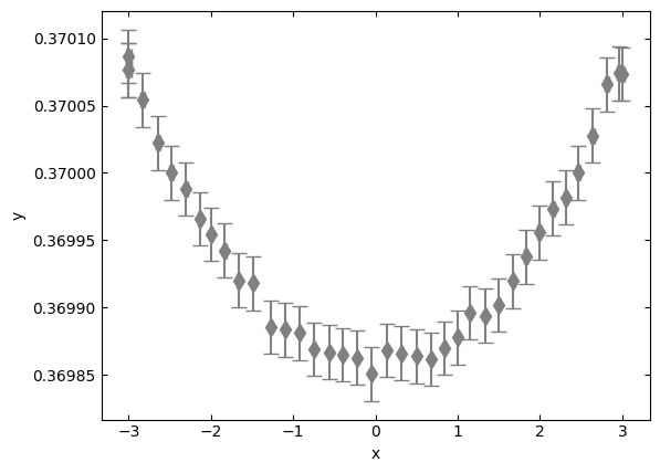
12.7.1. Example: Plotting with uncertainty#
The following data file contains an x and y data set
and values for their error bars (columns u_x and u_y, respectively). Plot this data with Matplotlib as a
scatter plot with grey diamond shapes. No title is needed, but do label the x and y axes.
Solution:
This lesson combines the act of loading in an external data file to Python and using the .errorbar() method from
Matplotlib. See the code block below for one possible solution:
import numpy as np
from matplotlib import pyplot as plt
%matplotlib inline

# Load data
data = np.loadtxt("./example_data/dataset_with_uncertainty.csv",
                           delimiter=",",
                           skiprows=1)

# Separate columns into individual variables
x = data[:, 0]
u_x = data[:, 1]
y = data[:, 2]
u_y = data[:, 3]

# Create figure
fig1 = plt.figure()
ax = fig1.add_subplot(1, 1, 1)

# Plot measured data
ax.errorbar(x, y,
            xerr=u_x,
            yerr=u_y,
            marker="d",
            markersize=8,
            linestyle="none",
            color="grey",
            capsize=5)

# Figure options
ax.set_xlabel("x")
ax.set_ylabel("y")
ax.tick_params(axis="both", direction="in")
ax.tick_params(top="on")
ax.tick_params(right="on")

# Show plot
plt.show()
12.8. Saving plots#
There are a few ways to export a plot for later use (e.g., homework, report, presentation). If you are using JupyterLab,
one simple way is to right-click on a plot and select Copy Output to Clipboard. From here you can paste
the figure in another program. While this method is fast, you do not have a lot of customization options when exporting
the figure. Fortunately, Matplotlib’s Figure class has a figure saving method called
savefig() that provides numerous
exporting options. This includes setting a desired DPI value, choosing a file extension, setting figure transparency,
and more. In the simplest case, the only argument needed is the filename. For example, the code block below saves
fig4 (i.e., the error bar plot from earlier) as a png file with the name test.png:
fig4.savefig("test.png")
If this command is issued in JupyterLab, it will save the file in your current working directory.
12.9. Concluding thoughts#
This lesson covered the basics in using the Matplotlib library to make impactful figures. The lesson first explained how
to import the pyplot submodule, which contains the necessary features for plotting, into Python. The lesson then
explained how to plot a single dataset. From there, the lesson explained how to improve the overall look of a figure by
adding titles, axes labels, tick marks, and other features. After this, the lesson covered how to make multiple dataset
figures, multiple panel figures, and figures with error bars. Finally, the lesson covered how to export figures for
later use.
As seen throughout this lesson, making figures with Matplotlib is relatively easy after understanding that a figure
contains two main objects: Figure and Axes. This lesson showed just a small subset of the numerous features and
customization options available when making figures. If you wish to learn more about Matplotlib, the official website
has numerous resources available including a tutorial page and a
code reference guide. Furthermore, internet searches on features or ways
to make plots using Matplotlib often lead to good resources.
12.10. Want to learn more?#
Matplotlib - Home Page
Matplotlib - Code Reference Guide
Matplotlib -Tutorials & In-depth Guides
Matplotlib - Example Plots
Matplotlib - List of Named Colors Guide
Matplotlib - Specifying Colors
Matplotlib - Marker Reference Guide
Matplotlib - Linestyles Guide